UX Design for note taking app

hero.do is a concept design for a task management app which I did this as a passion project, to give an idea about my approach towards a design problem.
The problem
People between ages 30-35 and working on remotely or in hybrid mode can face difficulties organising their tasks. The aim of this project is to understand the reasons for this difficulty, define main needs of users and find a solution that best answer these needs.
My role
UX Designer, interviewed 5 users and conducted usability test on 10 users.
Tools
Figma, Maze, Miro
The results
- Net Promoter Score of 8,7
- 80% of users prefer this solution to the current tool they’re using
- Average of 23s spent on homepage to add a new task
- Average of 4s spent on homepage to see expired tasks
detailed results are at the bottom of the page 🤓

Method source: Double diamond approach by Design Council
https://www.designcouncil.org.uk/our-resources/the-double-diamond/
Defining the problem
The idea of this project comes from a problem that I often have in my life; managing the “to-do”s. When I started talking about this with my friends, I realised how common was this problem (even those who seem perfectly organised). So my designer self took charge and decided to turn this into a passion project.

The research
Methods used
Survey, Semi structured interviews, Affinity map, User Persona, User Storyboard, Empathy map, Effort Impact matrix, Usability test
I started by sending a survey to 10 people ages between 30-35, living in a big city and working on a hybrid or completely remote based. What I wanted to learn from surveys was:
What methods are the target users using to organize their tasks, what they like and dislike about these methods and what are the things they wish they could have. Here is the set of questions I asked:

Survey questions
The survey helped me to diverge, and I converged by using an affinity map.

Affinity diagram of survey output
After defining some key takeaways from the survey, In order to have a more focused view, I conducted 3 semi structured interviews. I wanted to have a closer look into the “life” of the user I was designing for and understand better their context and habits.

Semi-structured interview questions
Here are some key insights from the surveys and interviews:

Key insights from semi-structured interview

Next step was to create the User Persona and Empathy Map, to understand better and empathise with the users.

User persona

Empathy map for the user persona
Defining the MVP
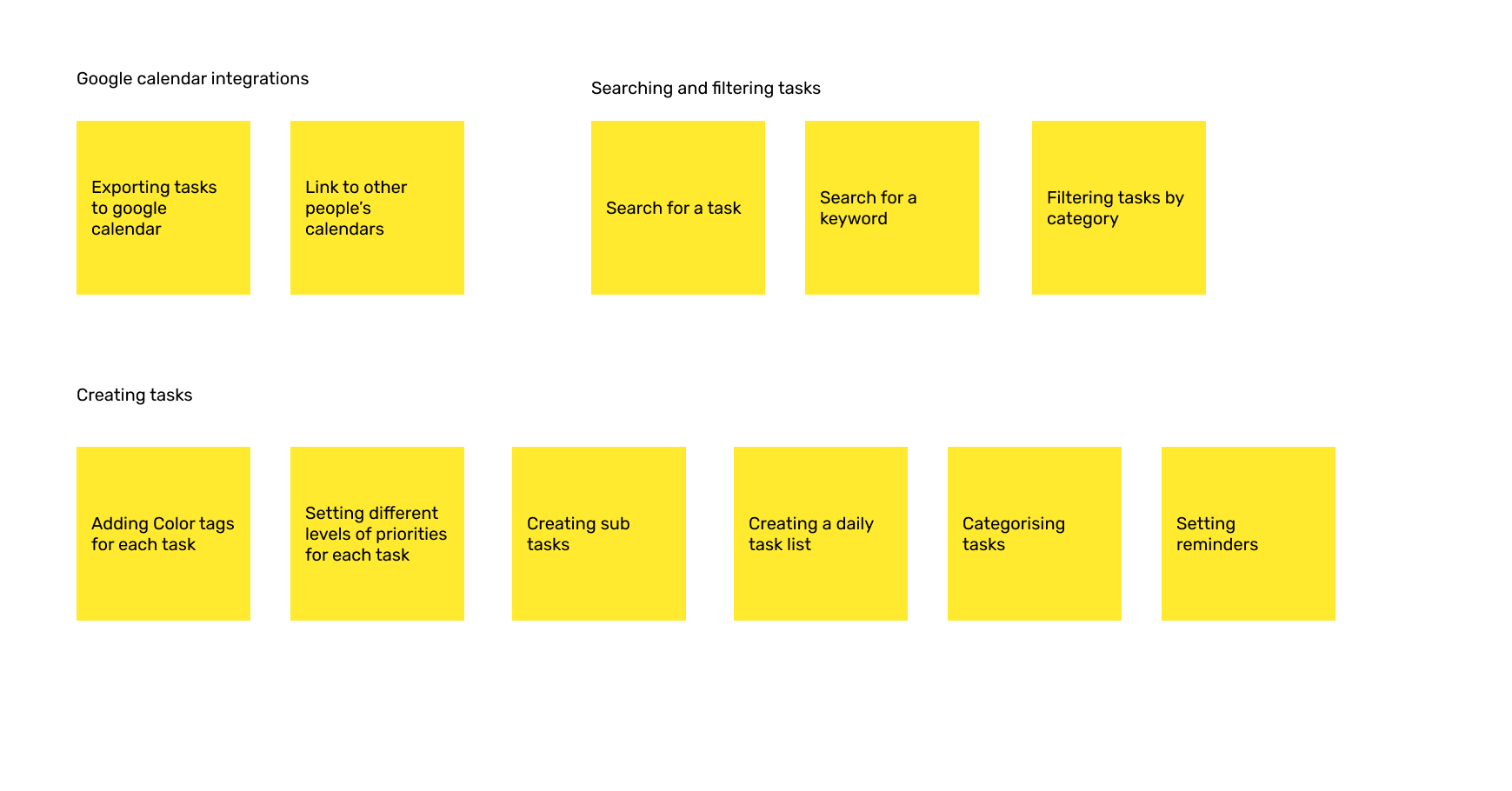
I created a list of features that will satisfy users’ essential needs.
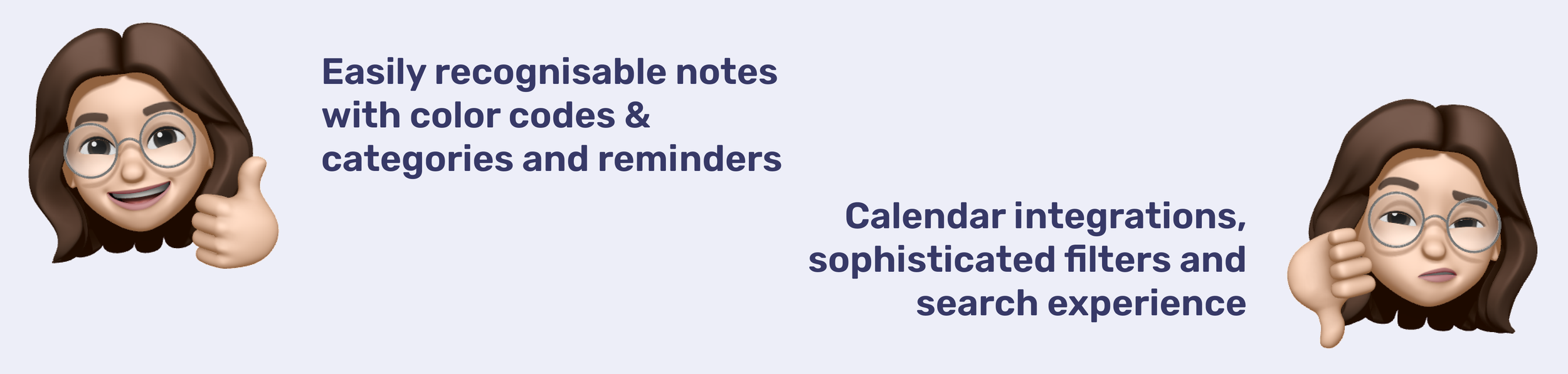
Since this is a MVP, it should include essential features that will satisfy user needs, without creating engineering waste. To prioritise the features to include in the MVP, I used an effort value matrix. I collaborated with a software engineer to define the effort needed to realise the features.
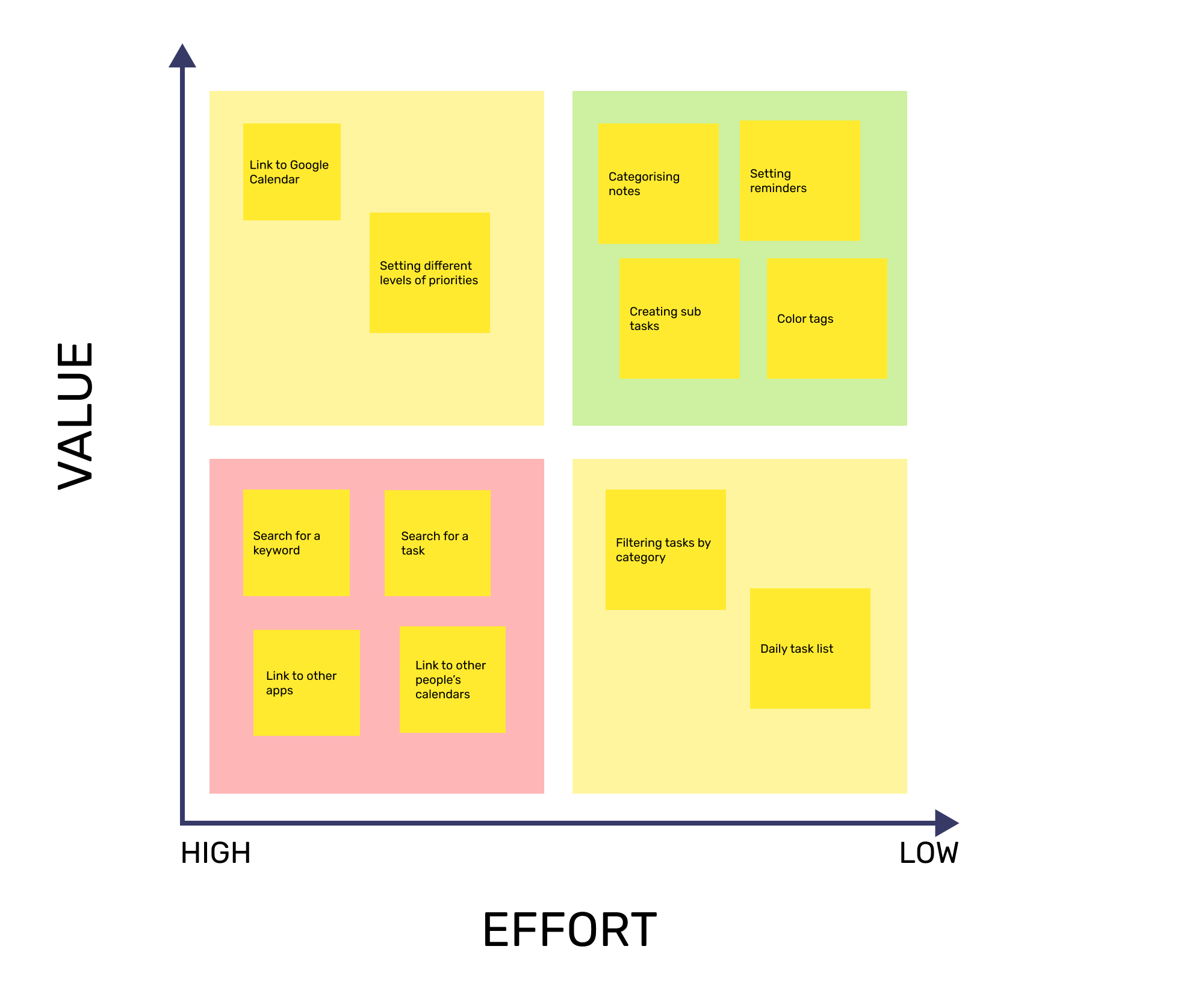
After this evaluation, I created a low fidelity wireframe that contains the basic functions to include in the MVP. I tested this mockup with 4 users.

Low fidelity wireframe which I used for user testing
Here are the key takeaways from the user tests:

Key findings from user testing
Final design
Based on the outcome of user testing, I created the high fidelity wireframe. Here are some examples about how user testing affected the final design.

Design decisions after user testing for homepage

Design decisions after user testing for new task page

Homepage of the app with different filters applied
Users have a clear view of expired tasks and upcoming tasks. It is easy to see deadlines and task categories.
Call-to-action to create a new task is visible. If a task expires, users receive notification.

Homepage with no tasks, view of a new task and notifications
Web version
From the UX Research, I’ve learned that the desktop version can be preferred for taking notes on work related tasks. I followed the design characteristics of the mobile version to create the high fidelity wireframes.

Homepage of the web app
Call-to-action is visible. Other functions like trash, archive and settings are visible from left navigation bar.
Clicking new task opens a modal to make the action faster.

Adding a new task
The results
I used Maze to analyse the performance as if this was a real product. I created a survey consisting of these questions:
Imagine you were trying to save a task for tomorrow to clean your room. Please could you show what you would do to get there?
How easy was this task? (on a scale from 1 to 5)
Imagine you were trying to see your expired tasks. How would you do it?
How easy was this task? (on a scale from 1 to 5)
How likely are you to recommend this tool to a friend?
Do you have any final thoughts on what you saw today?
And these are the results.

Thank you for viewing this project.
Drop me a message at secilicke@gmail.com if you have any feedback!