moc dashboard
Dashboard Design of Metabolism of Cities Living Lab
Overview
Designed a seamless user experience for data display dashboard for The Metabolism of Cities Living Lab of San Diego State University, leading an end to end extensive user research and significantly simplifying complex data ensuring that it is comprehensible by users of any experience level.
My role
UX/UI Designer owning the whole design process from an extensive user research to delivering robust wireframes and ensuring a smooth go to production having close contact with engineers.
Challenge
Displaying a high quantity of complex data sets in a comprehensible way was the core challenge. I tackled it by extensive user research and delivering a clean, minimal UI that is digestible by any level of user.
Results
Although the product hasn’t been launched yet, the user feedback from the usability tests conducted with 20 participants was outstanding, reaching an NPS score of 8,7. High fidelity mockups delivered were appreciated by the engineering team, reducing the go to market time drastically compared to previous conditions.
Story of the project
The Metabolism of Cities Living Lab is part of San Diego State University, carrying out research and activities in the fields of sustainability and aiming to provide an overview of San Diego City based on United Nation’s Sustainability goals. The Lab has organised countless events and demonstrated sensibility towards an idea of creating a community around these goals.
The Lab traces two types of goals; the SDGs and Leave No One Behind Goals, which focuses on wellbeing of the population. The lab has developed a tool to track the progress of San Diego City based on these two goals.
User Research
I conducted 5 interviews with main stakeholders and users of the Dashboard. The affinity map below shows the key findings.
Affinity map showing user research outcomes
I conducted 5 usability tests on the existing design. Based on these tests the pain points of the users are:
Information was scattered across various sections with no logical flow.
Complex data visualisations lacked context, making them difficult to interpret and leaving users overwhelmed.
The interface was cluttered with no clear visual hierarchy.
Users didn’t get an understanding of the lab’s main activity and origin of the information provided.
I tackled these problems by:
Creating one single touchpoint where two different types of goals, SDGs and LNOB, can be reached at the same time.
Create a homepage which links to the MOC-LLAB’s website’s Events section, to give users an idea of the lab’s main activities.
Created a standardised and clean UI which improves the digestion of complex information and reduces the go to production time.
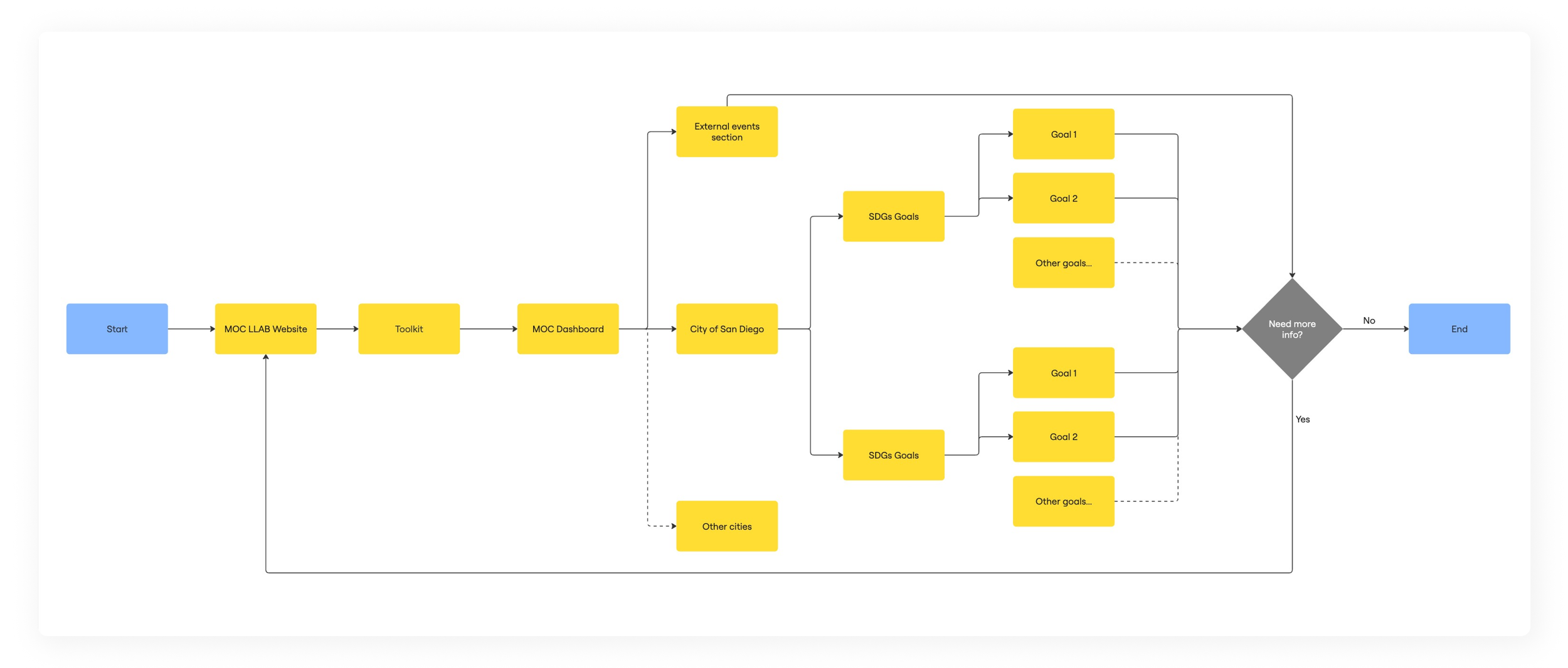
User flow of visualising both dashboards
This is the user flow in which users can access the two different types of dashboards from one single touch point.
Home page which links to goals tracking and events organised out by the lab
The new home page gives an overview of the lab’s main activity by linking to the events Section of the lab’s website.
SDGs Dashboard and goal tracking view
Users have 2 different sections, linking to SDGs and LNOB Goals tracking dashboards.
LNOB Dashboard and goal tracking view
The results
Users praised the clear grouping of data, making it easier to locate two different types of goals and their relevant data.
The simplified UI reduced overwhelm, making the metrics stand out more.
Users spent much less time understanding the data on the maps, thanks to the tabs that make navigation easier.
In overall, the improved layout and contextual visualisations made it easier for users of all backgrounds to find and interpret information, resulting in increased retention, satisfaction, and engagement. Close collaboration between design, research, and engineering ensured a user-focused solution that met both user and business goals. The new design reached an NPS score of 8,7 reducing the time spent on development by almost 50%.


