tabula
Tabula Web App

Overview
Designed a data-driven Fintech web application, focusing on simplifying complex user flows into an accessible and intuitive interface for non-finance audience.
My role
Owned end to end design process, translated previous User Research into an intuitive UI delivering detailed high fidelity mockups that indicate different user flows, creating the style guide of a brand new product.
Challenge
Simplifying complex financial data to make it digestible for users from different backgrounds, displaying clear call-to-actions, creating intuitive user flows and visually engaging UI.
Results
I delivered pixel perfect mockups, a style guide focusing on simplification, interactive mockup highlighting main user flows ensuring a smooth go to production. Product was a great success, obtaining a high satisfaction rate from its users.

Story of the project
Tabula is a software that helps non-financial institutions to manage their investments, created by IT Value Partner, an innovative startup with a focus on Fintech, delivering high quality product for top notch players in Italian Finance market . Tabula is user friendly and thought specifically for non financial clients, allowing personalisation of the platform based on needs. It allows user to generate custom reports to have in depth insights.
The key takeaways this product is based on are:
Non-financial users appreciate simplicity.
Complex user interfaces and inefficient user flows reduce engagement.
Style guide should reflect industry standards of accessibility, a strong brand identity and clear indications.
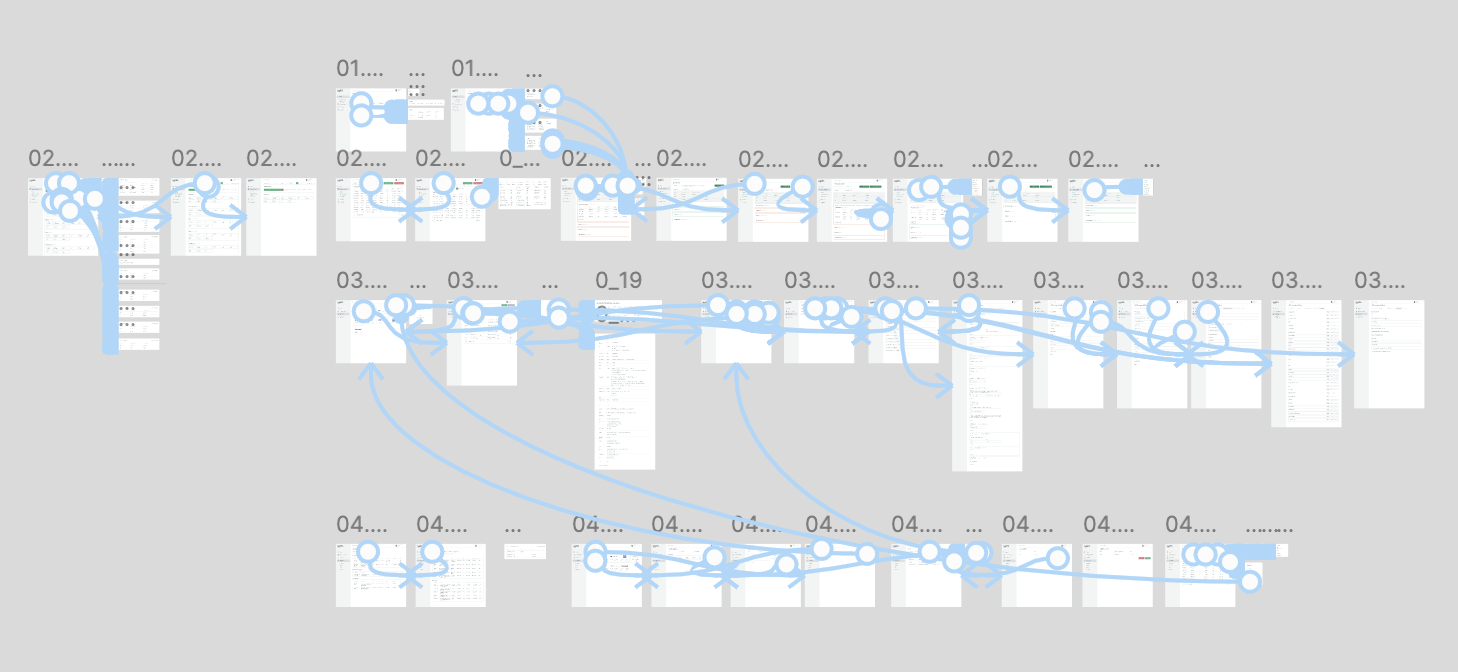
High fidelity prototypes that show main user flows
I addressed these points by:
Creating a minimalistic UI that highlights main Call-to-Actions and essential information.
Enhanced visual aspects by incorporating icons and company logos.
Creating intuitive user flows and clear data display to increase user retention.
Creating high fidelity wireframes that clearly display each user flow to ensure a smooth go to production.

Style guide
I created a style guide that praises simplicity and visual aesthetics. Below you can see the main screens that give an overview of user’s investments and year closures.

The results
The production process was simplified thanks to the high fidelity mockup and standardised components, and product launch was a great success. Users are now able to manage their yearly investments thanks to the clear UI and intuitive indications.