UX Design for project management app

workko is a concept design which aims to help remote working teams track each others progress.
The problem
Teams that collaborate fully remote or in hybrid mode have difficulty in tracking the progress of projects, since they aren’t able to see each other in the same workplace or speak to each other as often. In projects that require team members to be aware of who did what each day, this can be a problem. For example documents submitted by team members can be overlooked, causing delays in project deliveries.
My role
UX Designer, interviewed 3 users and conducted usability test on 10 users.
Tools
Figma, Maze, Miro
The results
- Net Promoter Score of 8,3
- 70% success rate in viewing the latest documents uploaded by colleagues.
detailed results are at the bottom of the page 🤓

Method source: Double diamond approach by Design Council
https://www.designcouncil.org.uk/our-resources/the-double-diamond/
Defining the problem
This idea originates from a problem I face a lot around me. The people who are working remotely or in a hybrid mode on the same project have difficulty tracking the deliverables of team members. This may cause delays in project deliverables and tension between team members which can harm productivity. I worked on this problem as a passion project, aside from my work activities.
The research
Methods used
Semi structured interviews, Contextual Inquiry, Affinity map, User Persona, User Story map, Usability test
I started by interviewing 3 people, 1 working completely remote and 2 in hybrid mode.
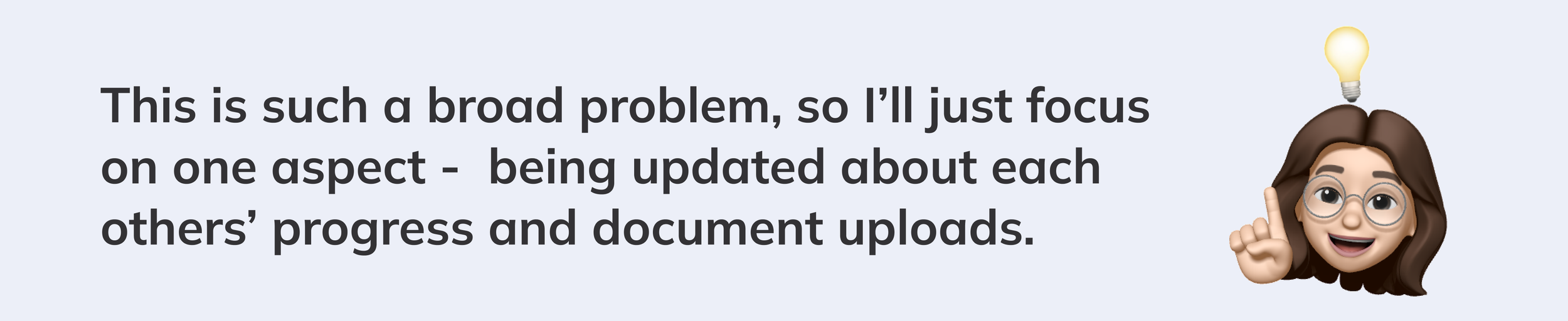
Given that this is a very broad problem, I decided to focus on a small aspect, but resolve that aspect in a very effective way.


Interview questions
The survey helped me to diverge, and I converged by using an affinity map.

Key insights from semi structured interviews
Next step was to create the User Persona and User Journey Map, to understand better and empathise with the users.
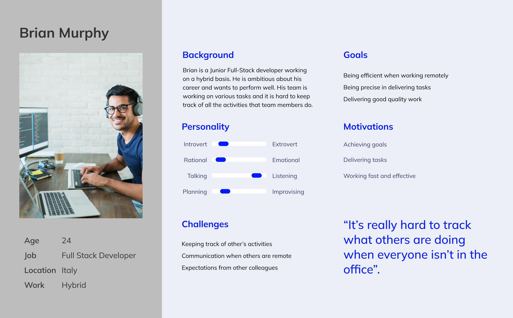
User persona

User journey map
Looking at the user journey, sharing updates and visualising documents seems to be the biggest pain point that even causes delays in deliveries. Given that it’s not possible to resolve all the problems at a time, I decided to keep my focus on this issue.
Low fidelity wireframes
I created low fidelity wireframes to test with users. I conducted 3 user tests. Here are some of the questions I asked during these tests:
Can you describe me what do you see in this page'?
How would you view the latest updates?
How would you view latest updated documents by your colleagues?
How would you view your projects?
Here are the findings from the user tests.
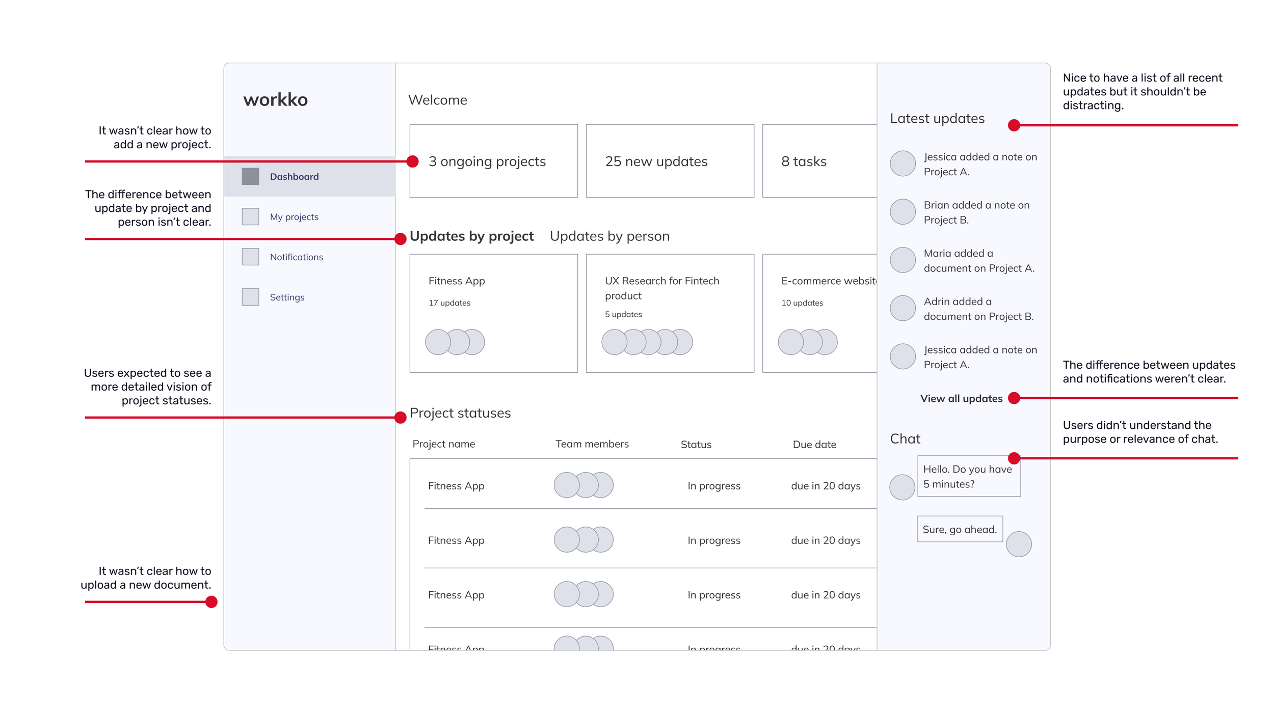
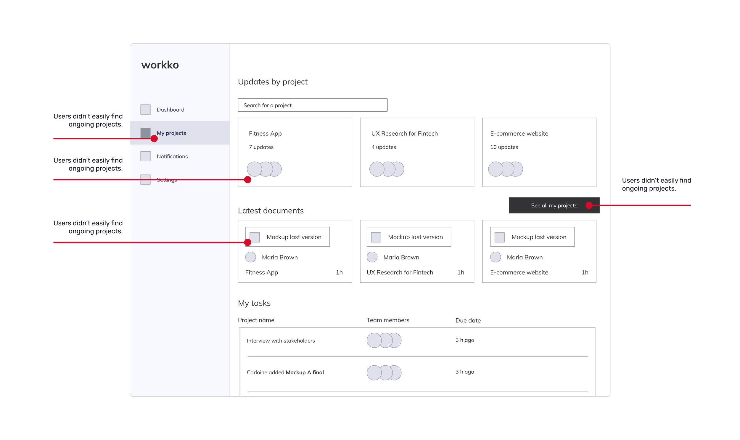
Here are the key takeaways from the user tests:


Final design
Based on the findings from user testing, I created a high fidelity wireframe that you can see below.

Dashboard
Project updates are highlighted on the dashboard, with visibility to My Projects from left navigation bar.
Document uploads and comments are highlighted on My Projects page.


Project history always remains visible on the right side.
The results
I used Maze to analyse the performance as if this was a real product. I created a survey consisting of these questions:
Imagine you were trying to view the latest documents updated by your colleagues. Please could you show what you would do to get there?
How easy was this task? (on a scale from 1 to 5)
Imagine you were trying to save view the latest updates on ongoing projects. How would you do it?
How easy was this task? (on a scale from 1 to 5)
Imagine you were trying to upload a document or update on one of your projects. How would you do it?
How easy was this task? (on a scale from 1 to 5)
How likely are you to recommend this tool to a friend?
And these are the results.

Next steps
This is a concept design which involves various users and contains data to keep track of. Deciding on its success, I’d define success metrics and keep track of them through analytics tool. These metrics could be:
How many users are on the platform / how much time they are spending
How many new projects are created
How many documents are uploaded
How many comments are made
External metrics which to measure if the product can bring an impact on the business could be:
Increase in customer satisfaction
The amount of customer complaints related to delays in deliverables
Increase in employee well being
Thank you for viewing this project.
Drop me a message at secilicke@gmail.com if you have any feedback!